Optima®
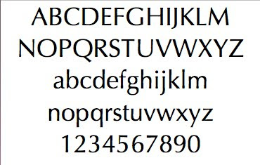

About this font
Optima, one of Hermann Zapf’s most successful typefaces, was released by the D. Stempel AG in 1958.
In 1950, Zapf made his first sketches for his “serifless roman” while visiting the Santa Croce church in Florence. He sketched letters from grave plates that had been cut about 1530, and as he had no other paper with him at the time, the sketches were done on two 1000 lire bank notes. These letters from the floor of the church inspired Optima, a typeface that is classically roman in proportion and character, but without serifs. The letterforms were designed in the proportions of the Golden Ratio.
In 1952, after careful legibility testing, the first drawings were finished. The type was cut by Stempel’s renowned punchcutter, August Rosenberger. Optima was also produced in matrices for the Linotype Machine. With the clear, simple elegance of its sans serif forms and the warmly human touches of its tapering stems, this family has proved popular around the world.
Optima is the typeface used for the text on the Vietnam Veterans’ Memorial in Washington, D.C.
quoted from: http://typophile.com/node/15685?
Why i like this font
It combines the clarity of modern face with the objectivity of sans-serif typefaces.Thus, it is highly recognizable but has a low fatigue to its audiences. The outline of Optima is not exactly erect, but with a micronic curve which makes the font formal, steady, without a sense of stiffness. The scale of its thickness is perfect, let the font seems fairly elegant.
Where do I normally use it
I normally use it on the advertisements, especially for cosmetics.
Exercise 2: research questions
Can I produce a font that expresses a boorish sense?Can I produce a font that expresses a compare of stillness and movement?
Can I produce a font that is stupid?
Can I produce a font that is luxury?
Can I produce a font that is aboriginal?
Exercise 3: Handwritten Lettering
This will be post later.
Exercise 4: Develop a sample of five letters that are “written” with unusual mark-making instruments.
attempt 1: Rough
This is an attempt to answer my first research question: Can I produce a font that expresses a boorish sense?
I think about using the surface of ground tile as bottom textile and the surface of sole as upper textile to produce such sense.
following is the whole process
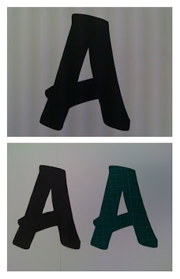 step 1: print and cut
 step 2:making the edge become rough
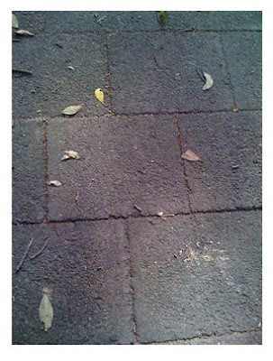 step 3: finding the bottom textile
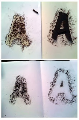 step 4: acquiring the textile on the paper
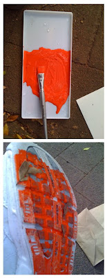 step 5:coloring the upper textile
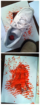 step 6: producing
 step 7: initial outcome
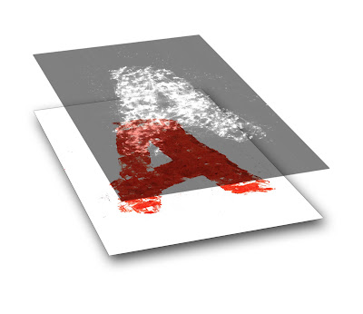
step 8: segistration
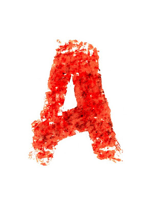 step 9: final outcome
attempt 2: light writing
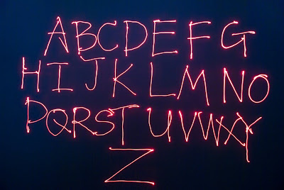
This is an attempt to answer my second research question: can I produce a font that express a compare of stillness and movement?
I use a laser pen to "write" the alphabets on a big screen with recording by a digital camera to achieve it in a dark photographic studio.
The alphabets is the track left by laser-light's movement which captured by camera, but nothing was really reserved on the screen. after the camera stop its shoot, it seems that nothing has happened before.
Hey Felix, I think this does convey the stillness and movement you are looking for as light sources (especially on dark backgrounds) do have that real transitory and temporary feel. I took some photos using sparklers and a long exposure to write words, so you ended up with lots of movement with the figure and then the words really bright. Don't know how relevant that is just interesting to me!
ReplyDeleteSome really great material experimentation here Felix - your laser pen experiments really start to unpack the possibilities of both responding to a research question as well as exploring a material experimentation that shapes and creates aesthetic interest
ReplyDelete