New research questions;
1. Can I produce fonts which is hairy?
2. Can I produce fonts which could change its shape as times goes by?
3. Can I produce fonts which could change it's state?
4. Can I produce fonts which could make u fat?
Saturday, October 3, 2009

Friday, October 2, 2009
Wednesday, September 23, 2009
Jenny's Exercise 1&2

I often use Comic Sans font for various purpose. I like the informality of it
and it is fairly stylized- hand rendered. It is similar to my own hand writing,
thus I feel comfortable reading and writing with it. This font is a little more
modern than serif font, and I think it is great to use for tables and charts
compared to the serif fonts. I also think that this font allow eye to follow the
text easier than fonts such as Times New Roman.
Where do I use it?
I use this font for making tables, charts, informal documents, comics and posters.
About this font
Comic Sans is a casual script typeface designed by Vincent Connare and released
in 1994 by the Microsoft Corporation. It is classified as a casual, non-connecting script,
and was designed to imitate comic book lettering, for use in informal documents. The
typeface has been supplied with Microsoft Windows since the introduction of Windows 95, initially as a supplemental font in the Windows Plus Pack. The font's widespread use,
often in situations for which it was not intended, has been criticized.
Comic Sans is frequently used in both comic books and webcomics as a substitute for hand-lettering, although comic artists usually prefer to use custom-designed computer
fonts instead. The Comic Sans font has been used on several products, including the
tags on Beanie Babies (since the late 1990s) and the 2004 Canada Day 25-cent collector coin.[6] It is also used in The Sims video game series.
http://en.wikipedia.org/wiki/Comic_Sans
Research questions
Can I produce a font that is easy on eye?
Can I produce a font with humour?
Can I produce a font for teenagers?
Who will be the target for the usage of this font?
Tuesday, September 22, 2009
Thursday Class Time and Place

Good to see that most of you have also now posted some experiments. I will try to comment on them this evening - but for now it seems a lot of you have tried cutting / ripping / moulding techniques that are a good start but tend towards a certain aesthetic that neglects some of the richness and individuality that can be made in shaping a series of letters into a unique and highly recognisable font with the characteristics and background that you have highlighted in your favourite font exercise. So for tomorrow I want you to prepare a few things so that we can have an intensive font making studio - you will need to bring in:
A wide brush and some ink / water colour
Graph paper
Soft lead pencils - 2b / 4b
Collect some found objects, twigs and sticks
A rule / compass and tape
Also -
Print out a full set of letter forms from your reviewed font - including upper and lower case, and other special characters, at 40pts
Return to your research questions and print them out with a series of responses that respond or note down avenues for experimentation and ways of investigating these questions (you may choose to focus on your best 3) eg:
Q - Can I produce a font that can be collapsible?
Notes - Try making letters from wooden components that are screwed together, try folding letterforms out of paper and throwing them in the air and photographing them, collect images of buildings, bridges and other built forms collapsing, review them for letter shapes and possibilities.
Q - Can I produce a font which can be modified?
Notes - Try to come up with a series of letter forms that when used can be placed over each other to create a range of possible variations on each letter shape...
With all of these we can then spend the class focusing on creating a series of possible starting points for developing a truly experimental, recognisable and useable font - I would like to try and focus on the letter A, G, Q, S and I
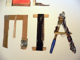
To get you thinking here are some letter forms from Neasden Control Centre's Polemia series - a project that combines action and experimentation starting with different choices of working material. The letter forms are an act of collection and acquisition, reclaiming lost or forgotten objects - as well as of creative juxtaposition. The real character of these letter forms come from the obvious made quality - the carry a 3-dimensional weight that comes from the careful construction and combining of elements on the one hand in balance, but also as an installation - out of scale with our usual experience of 'type'

Nina's Exercise 1&2

why i like it
Well, Gill Sans Ultra Bold , perhaps the typeface I use most. It is the typeface which continue to surprise me with their beauty and versatility. It seems lile every character have life and face with this kind of shape.
As we’re all probably aware Gill Sans is a pretty standard font these days, used and abused as a result of being part of a default font installation on certain operating systems. Like Times New Roman, a lot of people have become tired of its expressive curves (yes, that’s right, I did say ‘expressive’). I'm hoping after reading this, at the very least, you’ll look upon Gill Sans with fresh eyes.
In terms of Gill Sans Ultra Bold, I love its cute and round shape. The characters are hard, sculptured forms which clearly show Gill’s education and artistic roots. There’s the legibility of a serif face, balanced with the authority of a sans-serif. Gill Sans can seem friendly in its lighter weights, making it perfect for body text, and with its rounded letter forms and limited adornments, it’s highly legible. The bolder weights are perfect for display or signage purposes.
Personally, I think the character "a ,r, f, j"work well with this shape. Because they are balanced and hard. It looks like their have their own personality.
Where do I use it
Generally I use this typeface for propagand especially in comic books and animation.
About this font
Gill Sans™ Ultra Bold was first introduced in 1928. Eric Gill studied under the renowned
calligrapher, Edward Johnston, the designer of the London Underground sans serif typeface.
This influenced Gill who later experimented with sans serif designs, and in due course produced
a set of capital letters. Gill Sans Ultra Bold is a twentieth century sans serif that has a simplicity
of form which does not reject traditional forms and proportions, and gives the face a humanist
feel. The lighter weights are highly readable in text and suitable for magazine and book work,
whereas the heavier weights are best used for display in advertising, packaging, and labels.
The uppercase of Gill Sans is modelled on the monumental Roman capitals like those found on the Column of Trajan, and the Caslon and Baskerville typefaces.
The capital M from Gill Sans is based on the proportions of a square with the middle strokes meeting at the centre of that square. The Gill Sans typeface family contains fourteen styles and has less of a mechanical feel than geometric sans-serifs like Futura, because its proportions stemmed from Roman tradition. Unlike realist sans-serif typefaces including Akzidenz Grotesk and Univers the lower case is modelled on the lowercase Carolingian script. The Carolingian influence is noticeable in the two-story lowercase a, and g. The lowercase t is similar to old-style serifs in its proportion and oblique terminus of the vertical stroke. Following the humanist model the lowercase italic a becomes single story. The italic e is highly calligraphic, and the lowercase p has a vestigial calligraphic tail reminiscent of the italics of Caslon and Baskerville. Gill Sans serves as a model for several later humanist sans-serif typefaces including Syntax and FF Scala Sans. An Infant variety of the typeface with single-story versions of the letters a and g also exists.
The basic glyph shapes do not look consistently across font weights and widths, especially in Extra Bold and Ultra Bold weights, and Extra Condensed width. However, even in lighter weights, some letters do not look consistent. For example, in letters p and q, the top strokes of counters do not touch the top of the stems in Light, Bold, Heavy fonts, but touch the top of the stems in Book, Medium fonts.
The capital M from Gill Sans is based on the proportions of a square with the middle strokes meeting at the centre of that square. The Gill Sans typeface family contains fourteen styles and has less of a mechanical feel than geometric sans-serifs like Futura, because its proportions stemmed from Roman tradition. Unlike realist sans-serif typefaces including Akzidenz Grotesk and Univers the lower case is modelled on the lowercase Carolingian script. The Carolingian influence is noticeable in the two-story lowercase a, and g. The lowercase t is similar to old-style serifs in its proportion and oblique terminus of the vertical stroke. Following the humanist model the lowercase italic a becomes single story. The italic e is highly calligraphic, and the lowercase p has a vestigial calligraphic tail reminiscent of the italics of Caslon and Baskerville. Gill Sans serves as a model for several later humanist sans-serif typefaces including Syntax and FF Scala Sans. An Infant variety of the typeface with single-story versions of the letters a and g also exists.
The basic glyph shapes do not look consistently across font weights and widths, especially in Extra Bold and Ultra Bold weights, and Extra Condensed width. However, even in lighter weights, some letters do not look consistent. For example, in letters p and q, the top strokes of counters do not touch the top of the stems in Light, Bold, Heavy fonts, but touch the top of the stems in Book, Medium fonts.
Can I produce a font that formed with balloon?
Can I produce a font that is floating?
Can I produce a font that children would like to play with?
Can I produce a font that have face?
Can I produce a font that have more than 3 dimensional visual effect?
Monday, September 21, 2009
Alexia's homework

EUROSTILE
Why do you like it?
I think that the primary reason why I like it is that there is a nice blocky-ness to it. There is a definite squareness to it, but it is softened ever so subtly by the curves. It’s an old font, but I believe that Eurostile isn’t used that much because people tend to opt more for the gentler fonts like Helvetica, Gills Sans and perhaps even Futura to a degree. Eurostile has a particular strength and sense of dimension to it.
What characters work best?
For me I think that the K, B, G, S, O, a, e, k, m, t and o work the best because they have that balance between the rigid box and the subtle curve.
Those that could work better
I think that M, W, X and Z could work better if they were slightly more condensed because they feel wider than the rest of the Cap fonts.
How often do you use it?
Admittedly, I don’t use the font that often because a majority of the projects I work on are community and cultural based so it’s a tad inappropriate.
Where and why you use
I think that it works more as a title/subheading font to illustrate the strength of modernity or something along those lines – instead of body text.
What might you be able to learn from this as an exemplary font design?
It is ‘distinctive without being flamboyant’.
Historical Information:
Originally the type was created as an uppercase font and was drawn by Alessandro Butti (1893 - 1959, type designer and teacher. Art director of the Nebiolo type foundry in Turin), with help from his assistant Aldo Novarese (who later became one of Italy’s premier typeface designers). It was first called Microgramma.
Released in 1952 it was popular for the next 10 years, but proved difficult because it didn’t have lower case letters. In 1962 it was released with the lowercase letters and renamed Eurostile.
Linotype began distributing Eurostile decades ago, and during the early 1980s, it worked together with Adobe to bring Novarese’s creation into the digital age as PostScript fonts.
The most obvious attribute of Eurostile, other than its lack of serifs, is the squared quality of its design. Many of the letters look as if they began life by tracing the frames of old television screens. There is a symmetry and implied mathematical quality to the design. Hermann Zapf dubbed this the “super curve,” and worked with it himself in his serif newspaper face Melior®. The geometricity of Eurostile also puts it together with types like Avenir®, Futura®, and ITC Avant Garde Gothic®, even though Eurostile looks quite different at first glance.
Eurostile has a large x-height and is distinctive without being flamboyant. In plain text, this means that it is not a replacement for sans serif text faces like Univers® or Franklin Gothic™. Nevertheless, Eurostile is easy to use well, and it has the added benefit of standing out from the crowd of other typefaces in the sans serif genre.
http://www.linotype.com/5324/eurostilenext.html
RESEARCH QUESTIONS
What is my motivation for this font?
Who will I want using it?
Can it be have a multifaceted use?
What is the experience of this font?
How does the font affect the message I want to create?
Can it involve the ‘reader’ in producing it?
Can it be a learning tool?
I think I might extend my research from the publication. Tactile typography and the experience as opposed to just the look of a font.

 Highlighter on lined paper. I then used a scalpel to lift the letters from the page.
 Ripped up strips of paper and the folded them to create letter forms.
 Yoghurt letter forms. Yum!
felix exercise 1, 2, 3, 4
Exercise 1: My favorite font
Optima®

About this font
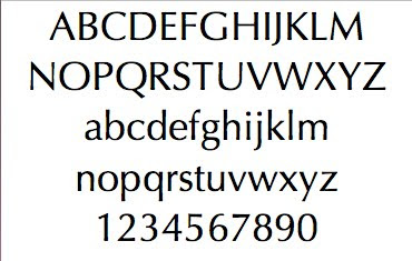
Optima, one of Hermann Zapf’s most successful typefaces, was released by the D. Stempel AG in 1958.
In 1950, Zapf made his first sketches for his “serifless roman” while visiting the Santa Croce church in Florence. He sketched letters from grave plates that had been cut about 1530, and as he had no other paper with him at the time, the sketches were done on two 1000 lire bank notes. These letters from the floor of the church inspired Optima, a typeface that is classically roman in proportion and character, but without serifs. The letterforms were designed in the proportions of the Golden Ratio.
In 1952, after careful legibility testing, the first drawings were finished. The type was cut by Stempel’s renowned punchcutter, August Rosenberger. Optima was also produced in matrices for the Linotype Machine. With the clear, simple elegance of its sans serif forms and the warmly human touches of its tapering stems, this family has proved popular around the world.
Optima is the typeface used for the text on the Vietnam Veterans’ Memorial in Washington, D.C.
quoted from: http://typophile.com/node/15685?
Why i like this font
It combines the clarity of modern face with the objectivity of sans-serif typefaces.Thus, it is highly recognizable but has a low fatigue to its audiences. The outline of Optima is not exactly erect, but with a micronic curve which makes the font formal, steady, without a sense of stiffness. The scale of its thickness is perfect, let the font seems fairly elegant.
Where do I normally use it
I normally use it on the advertisements, especially for cosmetics.
Exercise 2: research questions
Can I produce a font that expresses a boorish sense?Can I produce a font that expresses a compare of stillness and movement?
Can I produce a font that is stupid?
Can I produce a font that is luxury?
Can I produce a font that is aboriginal?
Exercise 3: Handwritten Lettering
This will be post later.
Exercise 4: Develop a sample of five letters that are “written” with unusual mark-making instruments.
attempt 1: Rough
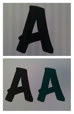
This is an attempt to answer my first research question: Can I produce a font that expresses a boorish sense?
I think about using the surface of ground tile as bottom textile and the surface of sole as upper textile to produce such sense.
following is the whole process
 step 1: print and cut
 step 2:making the edge become rough
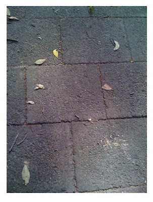 step 3: finding the bottom textile
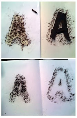 step 4: acquiring the textile on the paper
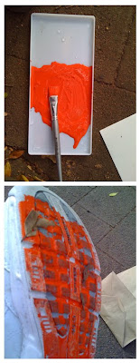 step 5:coloring the upper textile
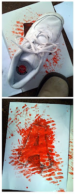 step 6: producing
 step 7: initial outcome
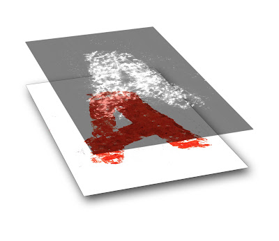
step 8: segistration
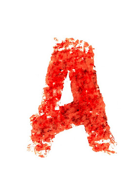 step 9: final outcome
attempt 2: light writing
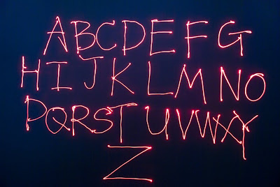
This is an attempt to answer my second research question: can I produce a font that express a compare of stillness and movement?
I use a laser pen to "write" the alphabets on a big screen with recording by a digital camera to achieve it in a dark photographic studio.
The alphabets is the track left by laser-light's movement which captured by camera, but nothing was really reserved on the screen. after the camera stop its shoot, it seems that nothing has happened before.
Optima®


About this font
Optima, one of Hermann Zapf’s most successful typefaces, was released by the D. Stempel AG in 1958.
In 1950, Zapf made his first sketches for his “serifless roman” while visiting the Santa Croce church in Florence. He sketched letters from grave plates that had been cut about 1530, and as he had no other paper with him at the time, the sketches were done on two 1000 lire bank notes. These letters from the floor of the church inspired Optima, a typeface that is classically roman in proportion and character, but without serifs. The letterforms were designed in the proportions of the Golden Ratio.
In 1952, after careful legibility testing, the first drawings were finished. The type was cut by Stempel’s renowned punchcutter, August Rosenberger. Optima was also produced in matrices for the Linotype Machine. With the clear, simple elegance of its sans serif forms and the warmly human touches of its tapering stems, this family has proved popular around the world.
Optima is the typeface used for the text on the Vietnam Veterans’ Memorial in Washington, D.C.
quoted from: http://typophile.com/node/15685?
Why i like this font
It combines the clarity of modern face with the objectivity of sans-serif typefaces.Thus, it is highly recognizable but has a low fatigue to its audiences. The outline of Optima is not exactly erect, but with a micronic curve which makes the font formal, steady, without a sense of stiffness. The scale of its thickness is perfect, let the font seems fairly elegant.
Where do I normally use it
I normally use it on the advertisements, especially for cosmetics.
Exercise 2: research questions
Can I produce a font that expresses a boorish sense?Can I produce a font that expresses a compare of stillness and movement?
Can I produce a font that is stupid?
Can I produce a font that is luxury?
Can I produce a font that is aboriginal?
Exercise 3: Handwritten Lettering
This will be post later.
Exercise 4: Develop a sample of five letters that are “written” with unusual mark-making instruments.
attempt 1: Rough
This is an attempt to answer my first research question: Can I produce a font that expresses a boorish sense?
I think about using the surface of ground tile as bottom textile and the surface of sole as upper textile to produce such sense.
following is the whole process
 step 1: print and cut
 step 2:making the edge become rough
 step 3: finding the bottom textile
 step 4: acquiring the textile on the paper
 step 5:coloring the upper textile
 step 6: producing
 step 7: initial outcome

step 8: segistration
 step 9: final outcome
attempt 2: light writing

This is an attempt to answer my second research question: can I produce a font that express a compare of stillness and movement?
I use a laser pen to "write" the alphabets on a big screen with recording by a digital camera to achieve it in a dark photographic studio.
The alphabets is the track left by laser-light's movement which captured by camera, but nothing was really reserved on the screen. after the camera stop its shoot, it seems that nothing has happened before.
Subscribe to:
Posts (Atom)