Sunday, September 20, 2009
Todays class - week 9
Mark's Excersice 4


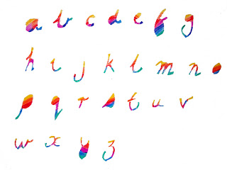
For exercise 4, I've playing around with a bohemian scarf and a perfume packaging. I like how these two objects turns out, each has a different feels to it. For the scarf, it looks a little bit organic and playful, more texture and color. While for the packaging its a bit bold and industrial i might say.
Wednesday, September 16, 2009
Miranda's exercises 2, 3 & 4
Ok I have to admit I really don’t understand the nature of this question so my answers may seem a little glib, but what is a toxic or washable font?
Can I produce a font that is edible?
Can I produce a font that causes people to have an epilectic fit?
Can I produce a font that brings tears to your eyes, in a good way that is?
Can I produce a font that people would want to wear?
Can I produce a font that makes your hair shiny?
Can I produce a font that will make me squillions of dollars?
Exercise 3
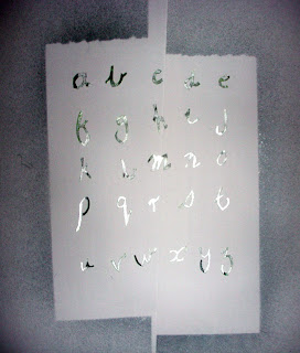
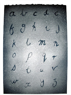
Handwritten lettering; well for this I handwrote my letters then cut them out with a scapel and then I made a stencil of them and spray painted them and also some other treatments. Not sure how successful they are but they definitely look like my handwriting which is messy. I wanted to try some ink versions of my fav font but no ink so that will have to wait.


Exercise 4
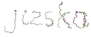
Here are a couple of experiments with making letters, one is some wooden drawing models and the other some wool.


Tuesday, September 15, 2009
Mark's Exercise 1 & 2

What
Bauer Bodoni Std 2 Black Italic
Bodoni is the name given to a series of serif typefaces first designed by Giambattista Bodoni (1740–1813) in 1798. The typeface is classified as didone modern. Bodoni followed the ideas of John Baskerville, as found in the printing type Baskerville, that of increased stroke contrast and a more vertical, slightly condensed, upper case, but taking them to a more extreme conclusion. Bodoni's typeface has a narrower underlying structure with flat, unbracketed serifs. The face has extreme contrast between thick and thin strokes, and an overall geometric construction.
Bodoni admired the work of John Baskerville and studied in detail the designs of French type founders Pierre Simon Fournier and Firmin Didot. Although he drew inspiration from the work of these designers, above all from Didot, no doubt Bodoni found his own style for his typefaces, which deservedly gained worldwide acceptance among printers.
Many digital versions of Bodoni suffer from a particular kind of legibility degradation known as "dazzle" caused by the alternating thick and thin strokes, particularly from the thin strokes being very thin at small point sizes.
Why
I like the classic characteristic of a serif font. With Bauer Bodoni Std 2 Black Italic, I like how it has that classic look of serif font but in the same time it is quite modern as well. The combination of thin and thick lines of Bauer Bodoni Std 2 Black Italic is what I believe that made this font looks excellent. The italic treatment of this font also add that modern feels to it. Other reason that I like this font is because this font would suite for a publication purposes. Such as for art and culture magazines or maybe posters.
Many serif font like Baskerville could feel a little bit stiff and quite straight, but no with Bauer Bodoni Std 2 Black Italic. I might say because in some ways, Bauer Bodoni Std 2 Black Italic can look quite organic and ‘chic’, but at the same time it still give that sense of seriousness.
I like the curve on the letter R and J. I think it just add the fun to the ‘family’. I also like the letter A, I think the combination between the thick and thin lines in A are just perfect. If I have to change one of the letter I would say Q. I don’t like how the the tail end at center of the circle. I would prefer it end from left to right.
When & Where
I normally use this font mostly for publication projects. However, recently I just used this font for a screen based project. You can see it here, http://www.myspace.com/janskub
Research Questions
1.Can I produce a font that are clearly to read or legible enough?
2.Can I produce a font that can still be use for a 10 to 20 years of time?
3.Can I produce a font that can be use in any type of medium? Print and screen based.
4.Can I produce a font that can be categorize as fun or playful?
5.Can I produce a font that inspired from everyday objects?
add:
6.Can I produce a font that inspired from Sydney's architectures ?
7.Can I produce a font that are fashionable ?
All letterforms of cocktail shaker
Monday, September 14, 2009
Cocktail Shaker

Why do I like this font? It has something to do with it’s retro style and it’s informality. I think it’s an elegant font reminiscent of the 1950’s. It makes me think “Mad Men” style advertising execs. I like it’s brush like strokes and the fact it looks a little hand drawn. It’s old fashioned but kind of new looking. Part of me is thinking Bewitched and part of me is thinking groovy font designer.
I really like the capital S. The way it kind of looks upside down with the bigger circular form at the top and the cheeky little hook it has up there. I think the capital F and T are the least successful letterforms, particularly the T - it looks a bit like a back the front 7. The W is kinda cute too with it’s curly piggy tail middle bit (I think it’s the cross bar but it’s vertical not horizontal).
Where would you use this font? I guess on anything that’s kind of informal? Maybe invitations or record covers or some kind of product branding. I don’t think you would get much use out of this font in the corporate world. I could see it used in a bar or venue, maybe a 50’s inspired diner? I guess what I can learn form this font is have a bit of fun with it, loosen up daddio!
Here’s some info I found out about the font and the designer:
About this typeface:
Wrap your chilly fingers around this ultra cool swingin’ typeface! Cocktail Shaker is a swanky retro connecting script born out of 1950s lounge culture. Often referred to as the ‘googie’ look, Cocktail Shaker blends a casual loungy script with clean readability and a twist of modern Atomic Age charm.
About the designer:
With over 330 typefaces to his credit, Stuart Sandler has solidly established a reputation as the premier designer of retro display typography inspired by 1950s popular culture. In addition to winning Minneapolis’ The Show for the last three year consecutively, he also has several typeface designs distributed by ITC Fonts, Bitstream, Agfa Monotype and his own Font Diner foundry. Between each font release, Stuart is out shooting photographs of old car dashboards and scouring dusty antique shops (the ones that smell like dad’s old army uniform), and jet-setting to spots all across America where fifties design still stands proudly. With a library of vintage periodicals and a host of ephemera, he’s often found pouring over his collection to recapture the design sense and style of the past. This research proves invaluable to him as he crafts new ‘old’ typefaces.
Website
This is the designer's web site http://www.fontdiner.com/ and I think if anyone likes the retro look this is definitely worth checking out. When you put the address in the address bar a little hamburger appears on teh side (geeky but kind cool). If you click on the free silverware button there is a whole page of free fonts, some more successful than but hell for free they are great!
Sunday, September 13, 2009
Online Class Week 8. Discussion and exercises
Looking at the project at: http://www.telegraph.co.uk/technology/google/5214077/Google-Earth-satellite-images-alphabet-created-by-graphic-designer.html
starts to explore this idea by way of exploiting our associations with letterforms so that particular shapes in the landscape can be arranged into an alphabet despite the amount of information contained in each image


Taking this further this project seeks to explore ways in which particular typefaces can communicate abstract ideas, complicated concepts or added layers of information simply in adjustments to the basic building blocks of letter forms. In a way you will need to be able to identify what your font is ‘saying’ to the reader – what particular contexts of use might your font have? Is there a particular feeling that your font evokes? If you were to describe your font as a personality what would it be?
Visit Ellen Lupton’s site thinking with type: http://www.papress.com/other/thinkingwithtype/index.htm
Be sure to you’re your way through this part: http://www.papress.com/other/thinkingwithtype/letter/anatomy.htm and familiarise yourself with the terminology and architecture of font and letterform design as it will help you to produce more informed font designs. If you have any comments or ideas after reading through the site post them here. Don’t forget to re-visit http://ilovetypography.com there are some really great posts relating to more type theory and terminology as well as interviews with font designers and what makes them tick. If you can dig up any font history that is engaging and useful or any links to do with how fonts are designed and thought about please post them in the comments so we can discuss them together in this online ‘classroom’.
EXERCISES
In a single blog post upload your research and development of work for the following exercises. I will then give feedback and comments on each during the week. Please offer your own comments to other students as well as being sure to read through my comments to see if any ideas or feedback could also be applied to your own work also.
Exercise 1 - what is your favourite font – list why you like it, which characters you think work best, those that could work better, how often you use it, where and why you use and what you might be able to learn form this as an exemplary font design. If possible see if you can find any interviews or historical information relating to the designer and why they designed it
---------------
Exercise 2 – list 5 – 10 research questions that you would like to use to help you explore and analyse your font designs as they are produced. For example: Can I produce a font that washes away? Can I produce a font that is toxic? etc
---------------
Exercise 3 - Produce handwritten lettering in a range of handwriting styles and propose a set of formal characters for your own handwriting – you can take this further by thinking about:
Using a range of tools for rendering you handwriting – ink, watercolor, scalpel, spray can, sticktape, etc consider the ways in which you different materials shape or change they way you ‘write’
Think about your personality – how can you make you letter forms express an aspect of your self?
Try re-rendering your favourite typeface in a way that allows you to own that typeface and push it into a new kind of type design
---------------
Exercise 4 - Develop a sample of five letters that are “written” with unusual mark-making instruments. The form of the letters should be adjusted to best respond to the way the tool you have selected makes marks. You might even consider forming letters in three dimensions and photographing them, experimenting with scale and surfaces, even producing fonts that change over time – here are some fun examples to get you started.
Please try to post your responses to these exercises by the end of the week so I can respond over the weekend – if you get them up sooner all the better. Check back on the blog regularly as I may post some additional information relating to font design thinking and theory as I start to see the work you produce… If you have any questions please leave them in the comments of this post.


