Thursday, October 29, 2009
Wednesday, October 21, 2009
CATEI Reminder
Also - can I remind you all to fill out a teacher evaluation survey at the CATEI site. Surveys close on the 25th so if you don't mind it would be great if you could take a few minutes to give some thoughts on how you found the studios
Tuesday, October 20, 2009
FINAL SUBMISSION GUIDELINES
For those that did not come in on Monday here is what you will need to submit by Monday November 2 at 9am either by email to karllogge@gmail.com or if you can uploaded to this blog or to somewhere that you can link to from this blog.
You will be submitting a multiple page font specimen booklet pdf maximum A4 (though you can choose to use a format that is smaller than an A4). I will be looking for a high degree of sophistication and attention to design detail in these pdfs. You should think of them as booklets that a graphic designer might access if they were thinking of buying your font. The reader of this booklet should be able to understand how your font works, how it is unique and be excited to use your font in their next design.
PAGE 1:
Should be a cover which contains the name of your font, your name, student number and course.
It should be no more than 3 colours. You can use images and or create an engaging design that indicates what your font is about. Take a look at the 2008/2009 specimen booklets at http://www.typefacedesign.org and the images used to promote the fonts at www.youworkforthem.com/fonts
PAGE 2:
3 Colour (max) page showing your research question rendered in your font.
Page 3:
In 50 - 100 words (using arial) give a rational or information as to how you resolved your research question in your designed font. You may also include 50 - 100 words on the features or unique qualities of your font. Also list the best uses for your font
Page 4: 26 characters (or more if appropriate) of uppercase rendering of your font (or equivalent) - 2 colours
Page 5: 26 Characters of lowercase set or equivalent additional set - eg bold / small caps / etc - 2 colours
Page 6: 4 colour. An image presenting your font in use - see the images produced at youworkforthem.com to get an idea of what might be required. You should be able to show off your font in use, so select words or a sentence that shows your font in the best light, emphasises a certain aspect of your font etc. You can present additional pages of your font in use if you desire
Research appendix - please also scan or digitise your research and add it at the end of the pdf. this should be roughly 3 -5 pages but can be more if necessary. You should show the evolution of your fonts design and can include other fonts you started but might not have finished.
Send your pdfs at ebook resolution
Sunday, October 18, 2009
Miranda's experiments
Sunday, October 11, 2009
Mark's font experiment & development
After have a thought at my research questions, I’ve decided to focus the question at contemporary graphic designers (since it is my field of interest) instead of contemporary artists such as Yayoi that I had discussed before.
Contemporary graphic designers such as France based ill-Studio, Maya Hayuk, Walter Allner; a Bauhaus-trained graphic designer, and hand drawn triangle illustration by Ondrej Jób; a Bratislava type designer inspired me for this font development.
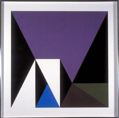
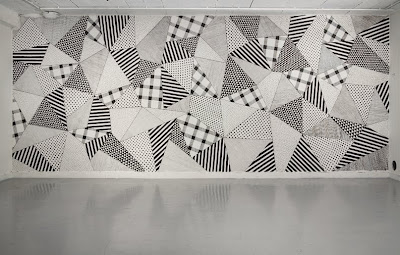
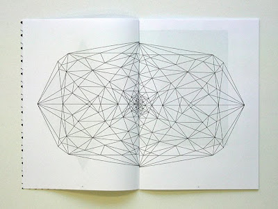
I started by sketching on piece of graph paper and move to illustrator to develop it more. I also experiment using pins and cotton (as seen bellow). I think this could be a quite nice set of geometric font. After seeing some of letters, I see that origami could be as a reference as well for further development.
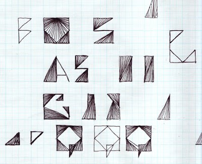

Here are some fonts that still in development.
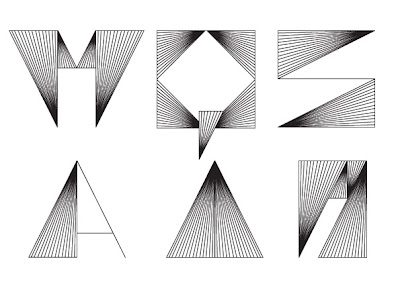
Contemporary graphic designers such as France based ill-Studio, Maya Hayuk, Walter Allner; a Bauhaus-trained graphic designer, and hand drawn triangle illustration by Ondrej Jób; a Bratislava type designer inspired me for this font development.


I started by sketching on piece of graph paper and move to illustrator to develop it more. I also experiment using pins and cotton (as seen bellow). I think this could be a quite nice set of geometric font. After seeing some of letters, I see that origami could be as a reference as well for further development.


Here are some fonts that still in development.

Saturday, October 10, 2009
try out
Saturday, October 3, 2009
Friday, October 2, 2009
Subscribe to:
Comments (Atom)


